Transforming a limited MVP into a high-engagement, multi-modal AI workspace for enterprise teams.
by implementing the "Master-Branch" logic, which removed the interaction tax of cross-referencing models.
through the new sequential workflow framework.
specifically the "chat clutter" issue that previously hindered project-based work.
into a transparent, high-trust subscription model that empowers users with full billing control.
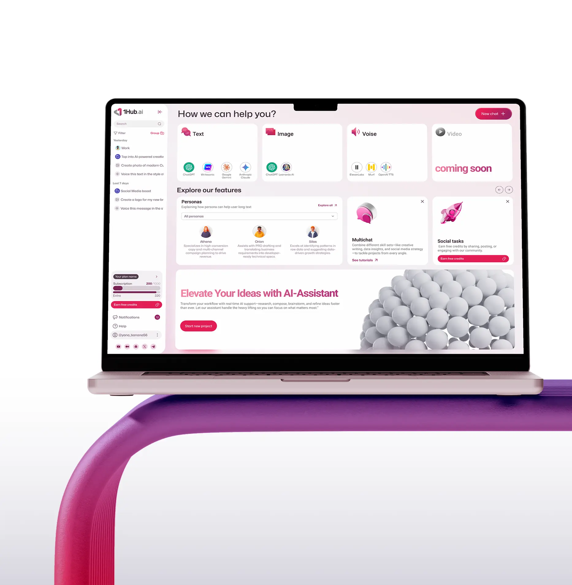
While 1Hub AI had the backend power for complex tasks, the MVP's "chat-only" interface hid this value. Users were dropping off because they couldn't see the platform’s unique potential beyond a basic ChatGPT wrapper.
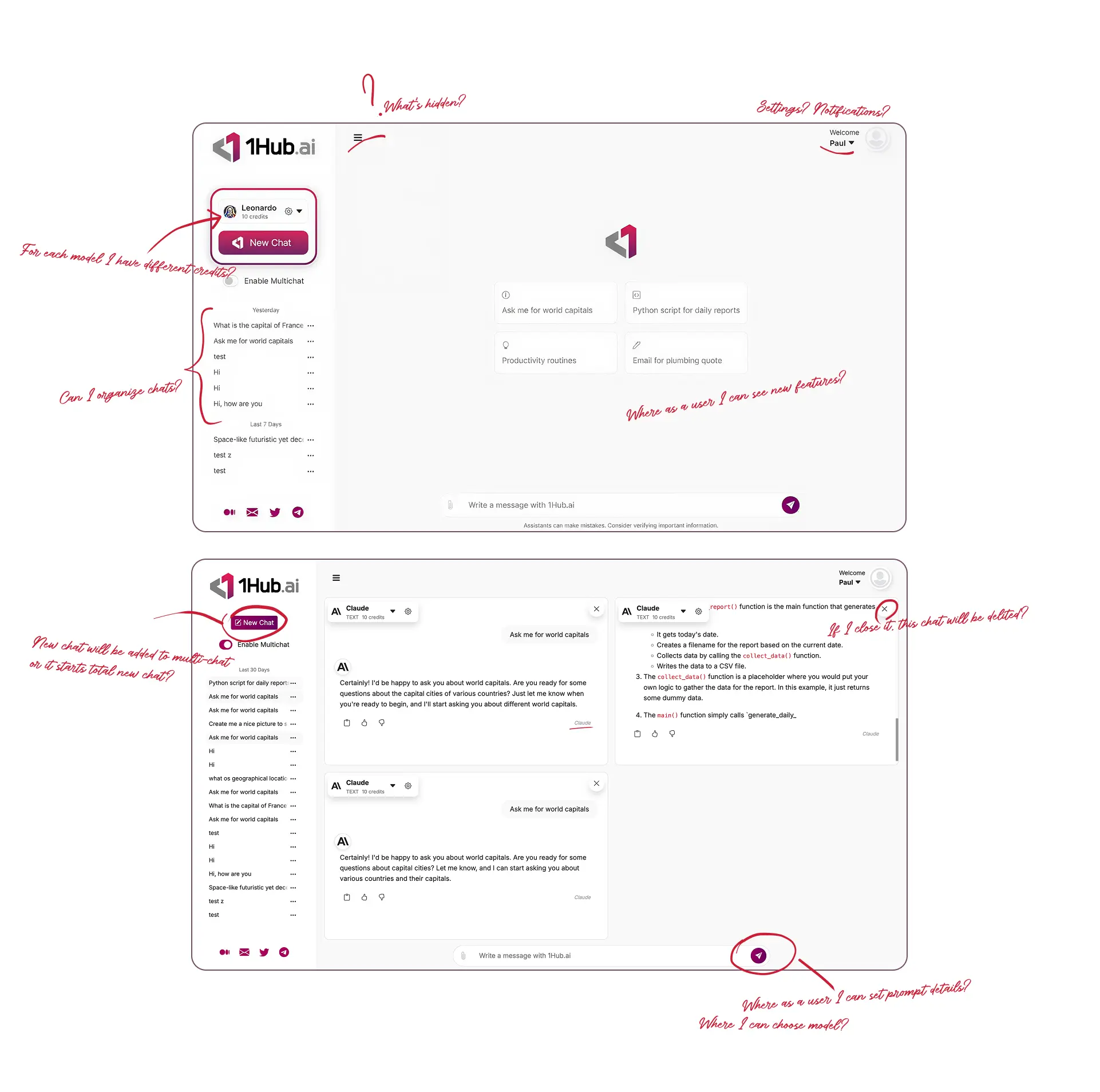
Power users were manually copy-pasting prompts across different AI tabs to compare results, creating a "context-switching" tax that frustrated the enterprise audience.
In a crowded AI market, the "Chat-only" look made 1Hub appear like a generic ChatGPT wrapper rather than a premium enterprise tool.
New users didn't know where to start. 1Hub's new capabilities were buried behind multiple clicks, leading to high drop-off during onboarding.
40% of the target audience were unable to use the tool because the MVP was strictly desktop-only.
All settings are scattered across different parts of the screen at different levels. Users did not understand where and how to set up their accounts, manage subscriptions, group chats, etc.
How might we evolve 1Hub from a basic chat interface into a multi-modal Intelligence Workspace that defines a new category of AI productivity?
I acted as the bridge between Business Vision and User Reality. Through rapid workshops and iterative feedback loops with stakeholders, we identified three "Core Pillars" to transform 1Hub from a basic utility into a premium ecosystem
I focused on identifying high-performance patterns from existing productivity tools and emerging AI interfaces. My research was a search for the "best compromise"—a way to fulfill the owners' vision for a powerful multi-model engine while keeping the interaction simple for the end-user.
I explored various AI platforms to identify which interaction models reduced "Time-to-Value". Users weren't just looking for an answer - they were looking for verification. Power users were cross-referencing Claude's logic against GPT's creative tone to find the most accurate "middle ground." While many tools focused on simple text input, they lacked the structure needed for professional, repeatable results.
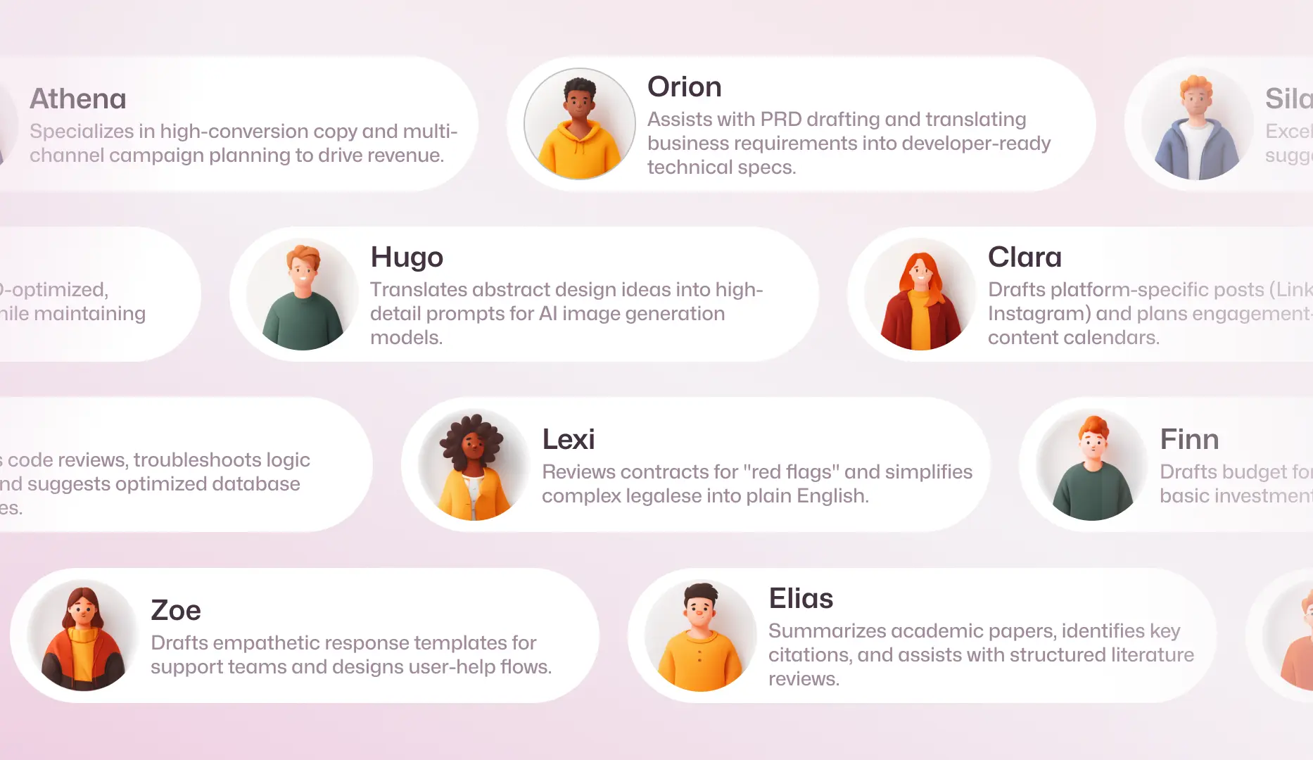
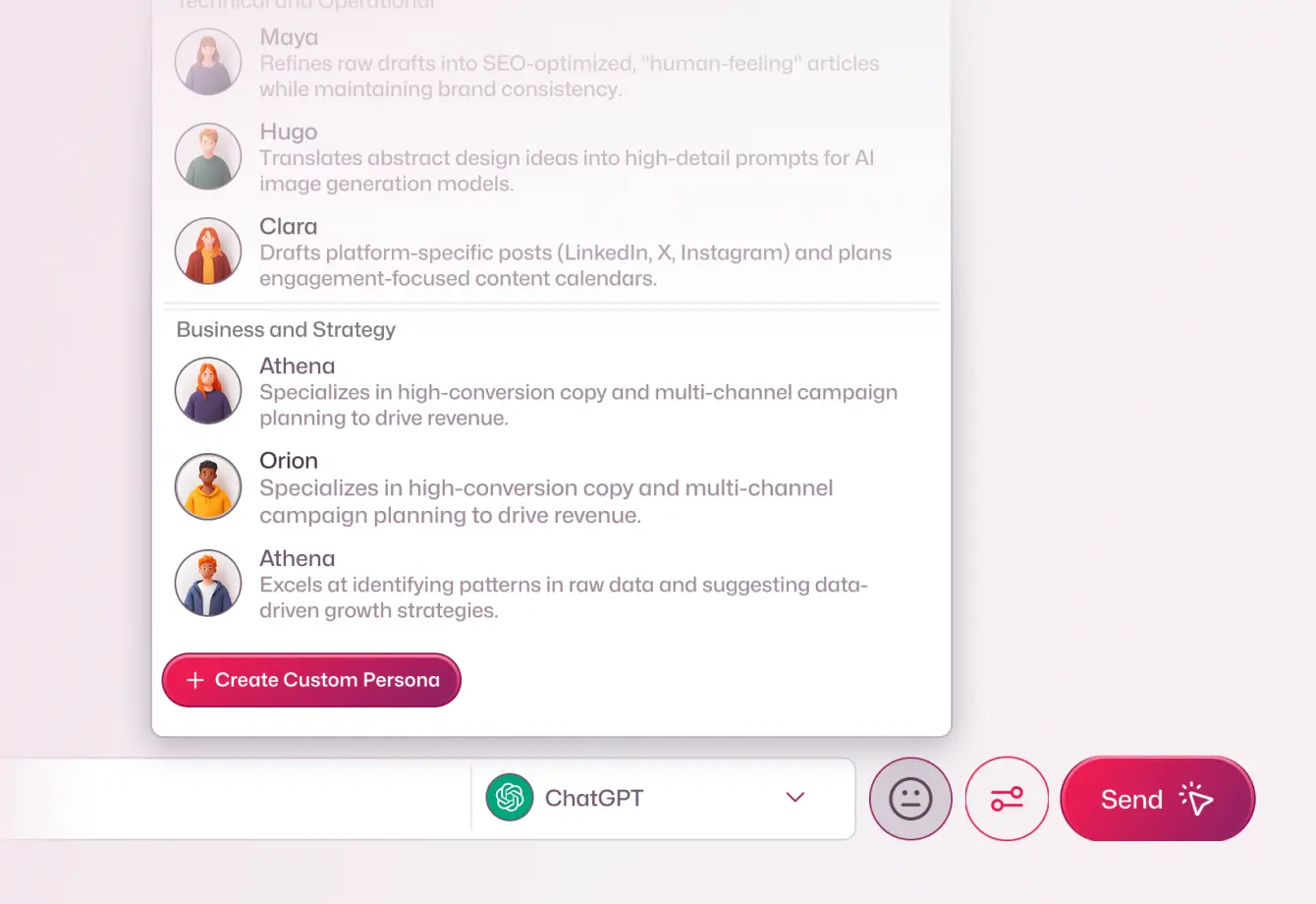
By analyzing how experts used AI, we designed "Persona Cards" that gave users the quality they desired while fulfilling the product's goal of being an "expert assistant".
I made main clusters of personas through curated professional roles:
1 - Business and Strategy;
2 - Creativity and Content;
3 - Technical and Operational;
4 - Specialized and Support.
In each cluster there are 3 more specific personas which will help user have varied answers.
If needed users may create and set they own persona.
I redesigned the search bar into a unified control center. Users can now select their AI model, technical settings, and professional Persona directly within the input field before broadcasting a prompt to all active windows.
.webp)
.webp)
.webp)
The heart of this project was the «Master-Branch» prompting logic. I designed it so a user could broadcast a single prompt to all four windows simultaneously to benchmark different models, but I also made sure they could «branch off» into an individual chat to go deeper with one specific persona without losing the overall context. The real flexibility comes in when the user returns to that master input to continue adding global prompts to the entire group, keeping the whole workspace synchronized.
This new architecture essentially removed the «interaction tax» of manual cross-referencing and reduced manual effort by roughly 75%. I also architected this to be fully mobile-responsive, ensuring that even on a small screen, the logic of selecting experts and models feels intuitive and professional. It really moved the needle from a basic chat wrapper into a high-performance engine—and honestly, made the old version look like a prototype by comparison.
.webp)
.webp)
During my user interviews, a staggering 85% of participants identified "chat clutter" as their primary source of frustration with the MVP. The original interface offered no way to group or filter conversations, which meant that as soon as a user started their fifth or sixth project, the platform became a bottleneck rather than a tool.
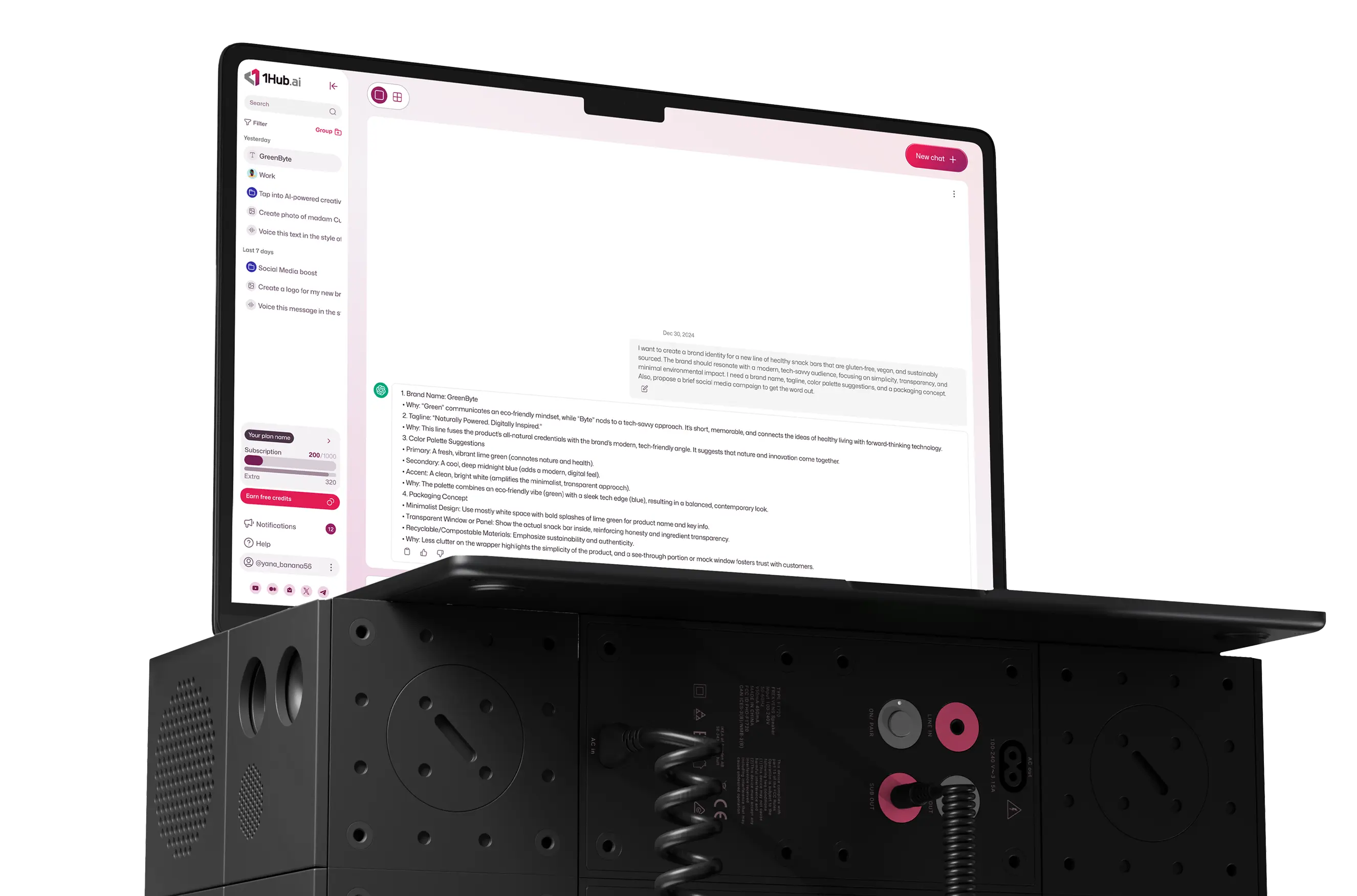
I solved this by creating a dual-layer organization system. First, I introduced a Quick-Search and Filter layer in the navigation menu, allowing for instant retrieval of project-specific threads. Second, I designed a dedicated "Manage Chats" dashboard. By moving from a standard list to a high-density table view, I gave users the professional tools they needed to categorize, bulk-archive, and manage their AI outputs as permanent business assets. This transition didn't just clean up the UI; it fundamentally changed how users perceived the product's value—moving it from a "temporary chatbot" to a "long-term intelligence hub".
.webp)
.webp)
The challenge was to take the complex financial requirements from the business owners and translate them into a high-trust, user-centric interface. My goal was to move away from the "hidden costs" feel of many AI wrappers and give users absolute clarity and control over their spending.
New comprehensive Subscription Dashboard breaks down usage with total transparency. Instead of just a generic "pro" tag, users can see exactly where their credits are going, including a detailed look at extra credits and specific plan features like access to multiple AIs.
To ensure users felt in charge, I created a Billing & Payment hub where they can manage their payment methods, update shipping info, and view a full invoice history with clear status indicators like "Paid" or "Pending". By converting business needs into a clear table-based UI, I empowered users to experiment with expensive models without any "billing anxiety," which was a massive step in building long-term product loyalty.
.webp)
.webp)
When I joined, 1Hub was essentially a powerful engine without a front door—there was no landing page to explain the value to the world.
I designed one from scratch, focusing the narrative on main features. I collaborated closely with a no-code developer to launch the site, ensuring the design translated into a fully responsive, high-performance live experience. This acquisition layer was the final piece of the puzzle, successfully moving the product from a prototype into a market-ready platform that effectively turns visitors into paid subscribers.
.webp)
.webp)
.webp)
Lovely! ❤️🔥
Thanks a lot for your work and ongoing efforts, we really like & appreciate what you created for us! Can't wait to have it realized & go to action, and enjoy putting smiles on peoples faces when they use our app! :))
Thank you for your continuous efforts, everything looks really great and we're more than happy with what you've created for us so far! ✊❤️
Looking back at the journey of evolving 1Hub from a fragmented prototype into a high-performance workspace, I’ve walked away with a few core insights that I now bring to every project. Honestly, seeing how much a bit of logical structure can change a user's day was the most satisfying part.
Seeing that 85% of users were drowning in "chat clutter" was a major wake-up call. It taught me that my first job isn't to make things look pretty, but to fix the structural friction that's actually slowing people down.
Designing the "Master-Branch" logic proved that users don't necessarily want "more features"; they want a single, intelligent command center that respects their time. Reducing manual effort by 75% came from re-engineering how the data flows, not just adding buttons.
Translating the business owners' complex financial goals into a clear, table-based billing UI taught me that transparency is the ultimate revenue driver. When a user feels in full control of their credits and billing, they are far more likely to upgrade to a premium plan.
Creating a modular UI Kit wasn't just about consistency; it was a gift to the development team. Cutting handoff time by 50% showed me that a senior designer’s real impact is measured by how much faster the entire team can move from an idea to a live product.