Wiel Coffee
The founders of Wiel Coffee came to me with a vision — they wanted to create a coffee brand that wasn’t just about great taste, but about meaningful connections and a sense of community.
Despite having an incredible product and good ideas, they felt a bit lost in how to bring all of them together. They needed a brand identity that told their story, connected with their audience, and stood out in the saturated coffee market.
.webp)
001 Exploration
A deep conversation with founders was the first step. We spent nearly 3 hours talking through every angle of the brand, from their passion for coffee and fine sense of aesthetics, to their unique vision for the community they wanted to build. It was an in-depth searching of what truly mattered.
Through this conversation, we dug into the brand’s core values and aspirations. Interestingly, some of their initial thoughts shifted as we unpacked the brand’s potential and defined what would make it memorable. This open exploration was essential, as it allowed us to shape an identity that felt authentic and aligned with their goals.
Findings
The founders’ love for coffee was matched by their keen eye for design. They envisioned a brand that would look as elegant as their coffee tastes, appealing to a community that appreciates both flavor and style. In a city filled with coffee options, Wiel Coffee wanted to offer something unique — an inclusive, high-quality experience that captured both warmth and sophistication.
One of the brand’s main goals was to create a welcoming space for Amsterdam’s immigrant community, using coffee as a bridge to foster connections and a sense of belonging. Education was another part of Wiel Coffee’s mission. They offer specialized workshops for companies and anyone interested in learning more about coffee. This focus on education reflects their dedication to coffee culture, inviting others to join in their passion.
Last but not least the founders' wish to emphasize environmental materials
.webp)
002 Research
The majority of brands focus to a niche market, often embracing artisanal brewing techniques and specialty coffee. By focusing on unique methods and high-quality ingredients, they establish themselves as destinations for coffee aficionados. Most competitors have a strong sense of place, using design elements. Deep, natural colors paired with simple, clean designs give a timeless feel, reinforcing a local identity. Brands with a history emphasize their origins, while new brands are boldly experimenting.
Since Wiel Coffee already has a community of Russian-speaking immigrants, they wanted to nurture and strengthen the connection between people. We came to the conclusion that community-oriented, accessible brands can be a bridge that connects people from different cultures based on a love of good coffee.
Excellent quality, wide choice and beautiful design are the new standards in the coffee industry. Most brands spend a lot of resources on experimentation, focusing on sustainability and quality sourcing. From doodles and illustrations gracing the front of pouches and aluminum buckets of beans to elegant flask-inspired glass bottles of RTD coffee, the creativity within the space never ceases to inspire.
Amsterdam is one of the largest cities, filled with people from different parts of the world with different cultures. It's easy to find something to suit your tastes here. Cultural diversity plays an important role in building brand identity. We saw an opportunity to reflect the ability to bring people together in the brand's visual language and messaging.
.webp)
003 Build strategy
This is the most important step to make the brand come alive. Working on it meant structuring all the previous findings and finding the right focus.
Connect cultures and build a warm community through the love of coffee. Guiding enthusiasts through the world of coffee.
The brand is rooted in values of quality, community, knowledge, exploration, elegancy and wormth.
In defining emotions, I used archetypes. For Wiel Coffee, it's the Explorer, the Everyman and the Jester.
Brand aims to open minded people, community seekers and, of course, coffee lovers. As subculture it is immigrants and IT companies.
When looking for the right tone of voice I was inspired by the founders, they have amazing personalities and I decided to bring their vibe to the brand. I choose character Elsa from Frozen 2 as face of Wiel Coffee. Elsa’s tone is warm, adventurous, and genuine. She speaks with curiosity and depth, always seeking meaningful answers and engaging in open, thoughtful conversations. Her words carry wisdom, like advice from a caring friend rather than a teacher, sharing knowledge only when asked. With a touch of magic, she brings joy and beauty to those around her, blending style and substance in everything she creates.


004 Ideation
In developing Wiel Coffee’s brand identity, I used a Polaroid photo as my guiding metaphor. What could be more warm and memorable than a small photo of your friends pined on refrigerator? Just like a Polaroid captures a moment in time, warm and unique, I wanted the design to evoke a sense of nostalgia, connection, and individuality.
With this approach, the brand identity aims to make every interaction feel like a shared experience — something special, authentic, and distinct, just like a Polaroid photo in a world of digital snapshots.
Simple color palette reflect brand’s archetypes:
1. Explorer - Morning Mist creates a warm, inviting canvas that highlights the other colors, giving the brand a soft and approachable feel.
2. Enjoyment - Joyful Orange is vibrant, warm color and symbolizes energy, excitement, and warmth, capturing the joy of coffee and the friendly.
3. Belonging - Soft Horizon conveys a sense of belonging and tranquility, supporting Wheel Coffee’s mission of inclusivity and community.
4. Additional - Deep Brew is a deep, almost black shade used for text, providing strong contrast for readability.
The logo design combines three elements — a coffee cup, a wheel, and an ecological leaf — into a single, cohesive icon that visually represents the brand’s identity and values. Together, these elements create a modern, minimalist icon that encapsulates the essence of Wiel Coffee: a welcoming space that values quality coffee, community, and sustainability.
1. PP Right Sans - Primary Font for Logo and Headers.Its clean lines and strong character give the brand a refined, stylish look while maintaining readability. This font’s contemporary feel adds sophistication to the brand identity, making it memorable and visually striking.
2. Inter - body font. This sans-serif font is widely recognized for its readability on both digital and print platforms, providing a comfortable reading experience.
1. For founders was important to use letter ‘W’ in design. A custom pattern inspired by the letter creates a unique visual element for the brand. This pattern, rendered in the brand’s primary colors, adds a recognizable and dynamic texture to various brand materials. It reinforces the brand’s identity subtly yet effectively, making it versatile for backgrounds, packaging, or other design elements.
2. The sliced effect was introduced to add a bit of “spice” to the design, creating room for experimentation with typography. This effect adds visual interest and a modern edge, allowing the brand to make a statement in minimalistic settings. Used carefully in headers and the logo, it brings a fresh, dynamic feel to the overall aesthetic while keeping the design balanced.
We chose eco-friendly paper embedded with flower seeds for printed materials. This choice reflects the brand’s dedication to ecology and aligns with its mission of nurturing community and environment. Each piece of printed material can be planted, giving back to the earth and creating a tangible, lasting reminder of the brand’s values. It’s a simple yet powerful way to make an impact, turning something as ordinary as paper into a small act of growth and care.


004/1 Diferent option
Wiel Coffee is a prism through which the whole palette of coffee flavour is revealed - a metaphor for this idea. When working on this idea, I wanted to show how vibrant and changeable the flavour of coffee is.
The exquisite taste, the enjoyment of life, and the search for new bright flavours are reflected in the play of light in the interior, in print and in the digital world. The bright accent colour pink also emphasises the fact that the business owners are women.
The minimalistic logo combines the coffee cup and wheel marks.
Why we didn’t choose this idea
The founders liked the idea, but it turned out that their friends in the coffee industry had recently rebranded to produce similar packaging. To avoid a conflict of interest, the idea was rejected.
.webp)
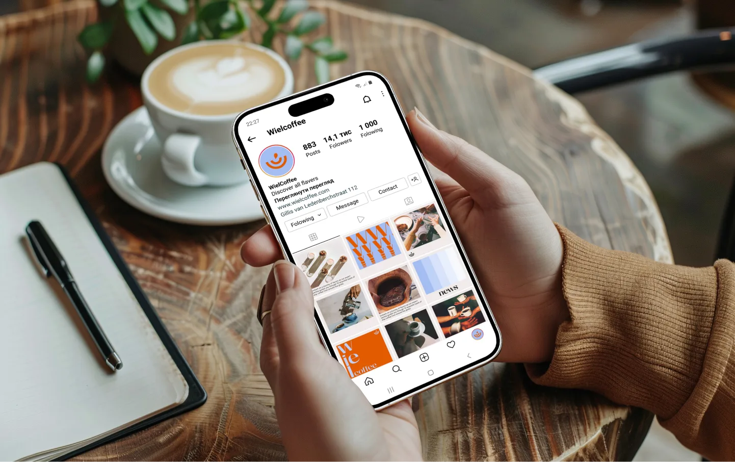
005 Results
The new brand identity serves as a strong foundation while leaving room for flexibility and experimentation in the future of Wiel Coffee. The founders are now able to explore creative ideas on their own, staying within the established visual framework. This balance between structure and freedom allows the brand to remain recognizable while encouraging innovation and creativity.
https://wielcoffee.com/
Thank you so much for our work together! it was a great experience. It was immediately clear that you are a great professional in your work. On the first call we had an in-depth interview where we asked very necessary questions that helped to produce a great result. In fact, in addition to the great result, deadlines were met, which is rare nowadays, we were wonderfully surprised!
Thank you so much for the awesome branding, we will definitely recommend you to people who need a corporate identity
Liliya and Ksenia, founders Wheel Coffee
.webp)